How Fiscal Crises Actually Unfold - And Where We Are Now
How Fiscal Crises Actually Unfold - And Where We Are Now
When most people hear fiscal crisis, they picture one thing: a market crash. Stocks plunge, headlines scream, and everyone scrambles for the exit.
A fiscal crisis might include a market crash - but that's only one version of the story. History tells of various kinds of fiscal crises, not just crashes and sirens blaring. Sometimes one evolves over weeks and months. Other times, the crisis grinds on for decades. One kind can inflate prices into the stratosphere while another freezes credit markets solid. If we lack the understanding that crises can take different forms, we're likely to end up reacting emotionally when the unexpected shows up - instead of thinking clearly.
Two recent works have been really helpful imagining how the current fiscal situation might evolve - Ray Dalio's book How Countries Go Broke and the Committee for a Responsible Federal Budget's January report, What Would a Fiscal Crisis Look Like.
Based on those two works, let's look at the crisis types and then build a simple framework - a map - that organizes what might occur. Then we'll look at where we seem to find ourselves right now. Not to predict anything. Just to see where we stand and the pressures that might push us in different directions.
Six Forms of Crisis
The first form worth understanding: a financial crisis. This unfolds when investors lose confidence, credit tightens, and asset prices fall fast. Think about 2008. Lehman Brothers collapsed on a September Monday, and within weeks the global financial system nearly seized up. Banks stopped lending. Markets froze before policymakers could even react. Russia's 1998 debt default triggered a similar chain reaction - nearly taking down Long-Term Capital Management, a hedge fund so large that its failure threatened the entire U.S. financial system.
The second form: an inflation crisis. This one takes hold when governments lean too heavily on money creation or financial repression to manage their debt burden. The 1970s in America offer a clear example - prices climbed relentlessly, savings lost purchasing power, and confidence in the dollar weakened year after year. Weimar Germany in the 1920s showed the extreme version with hyperinflation.
Notice the difference between these first two forms - financial crises break credit, while inflation crises erode money itself.
Now, the third form: austerity. Governments try to fix debt problems fast through deep spending cuts or sharp tax increases. After 2010, Greece became the textbook case. The economy contracted so severely that unemployment topped 27% and a generation of young professionals left the country. The UK pursued a milder version during the same period, and growth slowed considerably.
Three more forms round out the picture. A currency crisis develops when investors lose confidence in a country's currency, and it depreciates rapidly. The UK lived through this in 1992 when it crashed out of the European Exchange Rate Mechanism. The Asian Financial Crisis of 1997 spread similar contagion across Thailand, Indonesia, and South Korea - collapsing currencies while simultaneously freezing credit.
Then there's default - the most straightforward form. A government simply doesn’t pay what it owes on its debt. Mexico did this in 1982 and Argentina did it in 2001. Default damages credibility and locks countries out of capital markets for years.
And sixth - the one that gets the least attention but may matter most: the gradual crisis. No collapse. You won't read any dramatic headlines. Instead, you see slower growth, rising interest costs, and declining economic flexibility, year after year. Japan has lived in this space since the 1990s. Italy has experienced something similar. Debt never exploded. It slowly weighed everything down.
Here's the key insight: a fiscal crisis doesn't have to look dramatic to cause real damage.
Two Spectrums That Simplify Everything
Now, all six of those crisis types fall along two simple spectrums.
The first describes price pressure and runs from inflationary to deflationary. On the inflationary side, governments print money or repress interest rates, currency weakens, and prices climb. On the deflationary side, credit contracts, asset prices fall, and liquidity dries up.
The second spectrum measures speed - acute versus gradual. An acute crisis shocks markets and forces rapid adjustments. A gradual crisis erodes purchasing power or growth over years, sometimes decades. Fast crises feel dramatic. Slow crises feel deceptive - and that deception makes them dangerous in their own way.
The Crisis Navigation Map
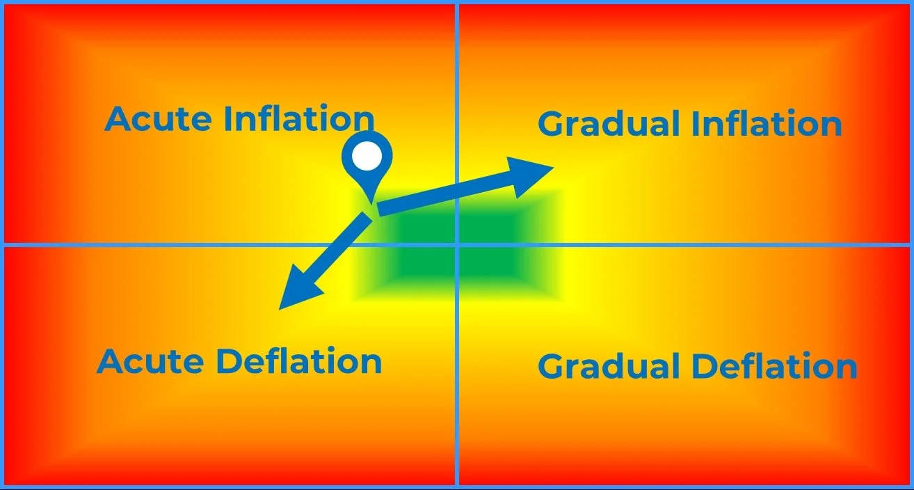
Combine those two spectrums and we get a simple 2×2 map. Inflation versus deflation on the vertical axis. Acute versus gradual on the horizontal.
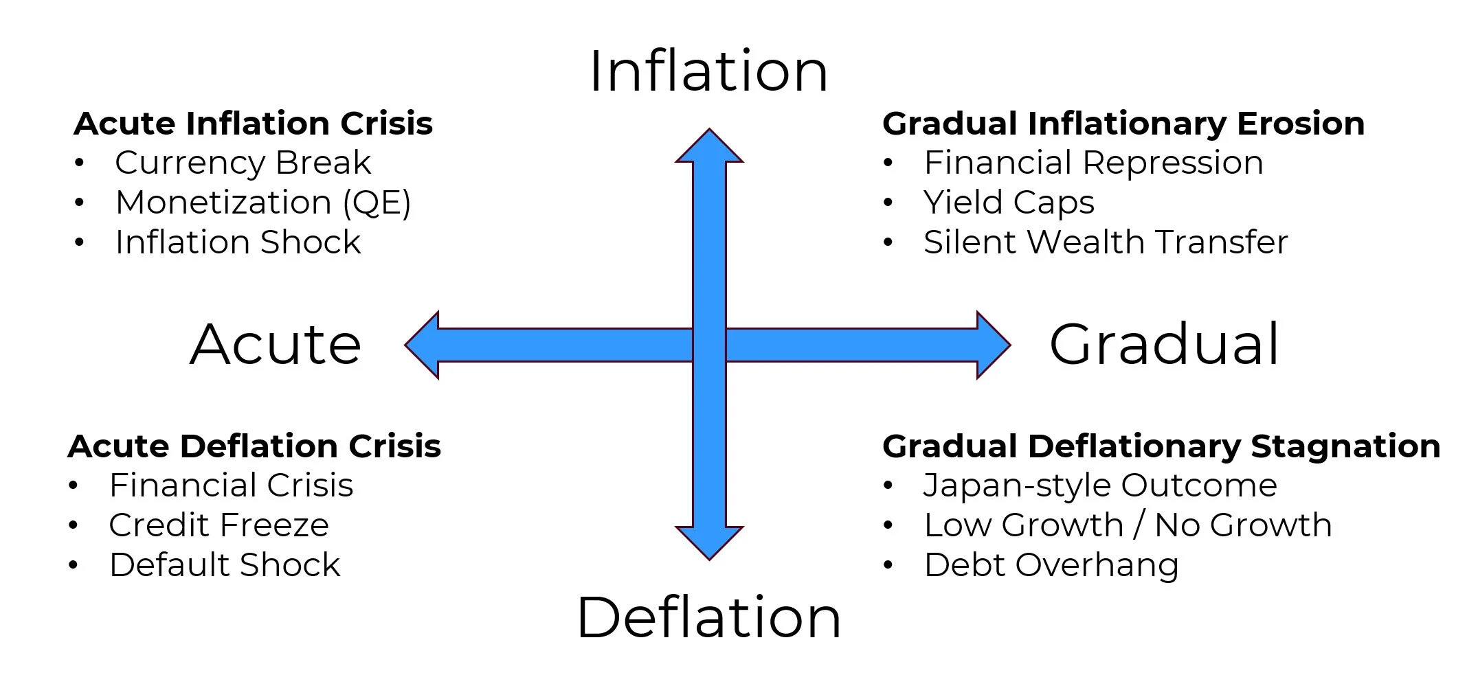
That gives us four broad regimes: acute inflation (upper left), gradual inflation (upper right), acute deflation (lower left), and gradual deflation (lower right). The center represents a tension zone - stresses exist, but they haven't fully expressed themselves. As conditions drift toward the outside edges, one regime will dominate and narrow policy options.
Crises don't start at the edges. They move toward them.
Where We Might Stand Right Now
So where does today's environment fall on this map? Current indicators suggest we sit slightly on the inflationary side, still close to the center on the edge of the green zone in the diagram below. U.S. debt levels hover around 100% of GDP. Interest costs have climbed sharply recently. Treasury markets show strain - but they don't appear anywhere near a collapse. In addition, policymakers show a strong preference for managing the debt load gradually rather than allowing defaults or imposing severe austerity.

That combination suggests the most likely drift pushes us toward gradual inflationary erosion - financial repression, interest rates held below inflation, purchasing power slowly declining.
But another path exists. If confidence in the US Treasury markets were to break suddenly - through a policy error or an external shock - the system could shift quickly toward acute deflation. That would mean credit tightening, falling asset prices, and emergency intervention.
Two possible directions. One drifting gradually. One arriving fast. We'll keep watching.
Why This Matters
The purpose of this map isn't to predict a disaster. It's to educate, prevent confusion, and provide some clarity on possibilities beyond a "simple" market crash crisis.
When we understand that fiscal crises come in multiple forms and that they also evolve their form over time, we stop asking "Will there be a crash?" and start asking far more useful questions: "Is there fiscal stress now?" and if so, "What direction is the stress pushing conditions?"
That shift changes everything about how we respond. It encourages discipline instead of fear. Systems instead of speculation. Preparation instead of prediction.
That's exactly the thinking behind our SmartSignal System - a rules-based approach that adjusts asset exposure based on trend and momentum, so the decision about how to respond doesn't depend on trying to predict which crisis path unfolds. It depends on following the signals.
Because the real risk isn't that a crisis exists somewhere out there. The real risks? Not having a clue or positioning for the wrong one.
+++++++++++++++++
To receive helpful information like this for self-directed investors within 10-15 years of retiring, click here for our free weekly newsletter.
Important Disclosures
Past performance does not guarantee future results. Investing involves risk including the possible loss of principal.
The performance shown combines two different kinds of data. Results from January 2003 through December 2024 reflect backtested application of the SmartSignal methodology to historical price data. Results after January 2025 reflect actual signals delivered to subscribers during that period.
Backtested performance has inherent limitations. It does not represent actual trading. Backtested results benefit from hindsight and do not reflect the impact of trading costs, execution slippage, market liquidity, or the psychological pressures of investing real money during live conditions. For these reasons, backtested performance may differ materially from actual results. Individual subscriber results may also vary based on execution timing, account composition, and other factors.
TenHundred Co., its officers, employees, and partners may hold positions in the ETFs or securities referenced by the SmartSignal methodology, and may trade those positions without notice. TenHundred Co. reserves the right to modify or discontinue the methodology at any time, and past performance data may not reflect the current methodology.
Growth Guardian Investor publishes systematic investing education and methodology training under the publisher's exclusion to the Investment Advisers Act of 1940. We do not provide personalized investment advice. Subscribers make their own investment decisions.
Full Disclaimers Statement on www.gginvestor.com.